Showing posts with label Calligraphy. Show all posts

September 5, 2016

Civil War Stationary and Envelope Templates


"Good bye my sweet little wife -- write to me often"

-Jedediah Hotchkiss to Sara A. Hotchkiss, August 4, 1861

Some of the most prolific cries in Civil War soldier's letters is "Why don't you write me more?" and "Tell everyone to write me!" Mail delivery was highly anticipated by soldiers who felt left out of the events on the home front. Letters were a huge source of information and the main source of communication back home to the common soldier. It was reported that some regiments were sending out around 600 letters per day.   

I've been meaning to get some reproduction Civil War stationary and envelope templates on here forever and my friend Austin Landis was nice enough to lend me these letters for this post. The letters are from a collection of letters written by a Pennsylvania family writing to each other during the war.

Stationary and envelopes during the Civil War period were beautiful. They typically featured patriotic messages, imagery and political cartoons. It was not uncommon for envelopes to be as decorative as the stationary. Soldiers had the option to write "Soldier's Letter" on the front of their envelope to have the recipient pay for the postage due to the trouble of tracking down stamps and keeping stamps usable in the field. In 1861, the cost of mailing a typical letter was 3 cents if it was travelling under 3,000 miles. In the Confederacy in June 1861, it was 5 cents to mail a letter that was traveling under 500 miles.     


Civil War Era Letter and Envelope Templates for Reenacting | World Turn'd Upside Down
From the private collection of Austin D. Landis


Civil War Era Letter and Envelope Templates for Reenacting | World Turn'd Upside Down
From the private collection of Austin D. Landis


Civil War Era Letter and Envelope Templates for Reenacting | World Turn'd Upside Down
From the private collection of Austin D. Landis


From the Library of Congress


Civil War Letter Templates to Print:


A common size of stationary during the Civil War was 8. 5 x 11 inches folded in half width way. 


Back of the stationery page.

Civil War Era Letter and Envelope Templates for Reenacting | World Turn'd Upside Down

3 x 5.5 inches was a common envelope size. Print this out on heavy paper and use it as a template for tracing out envelopes. Fold along the dotted line. Each envelope fits on an 8.5 x 11 page.

If you right click on the images and "open in a new tab" If you print the images at 100%, they should be the correct size to use.

Click here to see more Civil War Envelopes!

August 18, 2016

Help Decode 15,971 Civil War Telegrams!


The Huntington Library is looking for volunteers to help decode and transcribe 15,971 telegrams sent by the Union Army during the Civil War. These telegrams are part of the Thomas T. Eckert Papers which not only contain everyday wartime communication, but are also know to contain coded messages to Abraham Lincoln.  The project aims to make these messages available online and accessible and is funded by a grant from the Publications and Records Commission (NHPRC).

Eckert was the aide-de-camp of military telegraph operations for General McClellan and soon became the administrator of the War Department's military telegraphs at the capitol and went on to become Assistant Secretary of War in 1866. The telegraphs are part of his personal collection and no doubt hold a lot of new information about the war that can only be discovered if everyone helps!  

July 25, 2016

18th Century Bookbinding with Ramon Townsend

18th Century Bookbinding

Today I was fortunate enough to attend a class on Colonial Bookbinding will Williamsburg trained bookbinder Ramon Townsend at the Harrinton House, home of Walter Staib's A Taste of History.

First off, I was really excited to take this class as I love little journals and notebooks and have made quite a few in my life but have never had the chance to learn how to make them the 18th century way. I'm not kidding. I was so excited to take this class that I had that dream where you are late for something important and then everything that happens makes you more late. The universe also threw me for a loop when the morning of class my car decided it didn't want to start but finally acquiesced last minute and I made it in time. The class was so much fun and everyone left with a pretty book and I'm now in love with marbled paper.

I took a lot of pictures during the class in case anyone is interested in the whole process or curious exactly what is under the spine of old books. We used rag paper, paste and leather so these books should weather time as good as 18th century books have. Well made, 18th century books fare surprisingly better than many 19th century books due to the use of rag paper over wood pulp paper.

18th Century Bookbinding

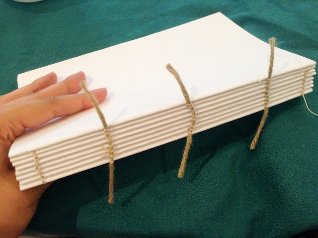
We each used a sewing frame to hold the cords in place for sewing. We each only made one book but the frame is designed to sew a stack of books at one time.

18th Century Bookbinding

18th Century Bookbinding

18th Century Bookbinding

We learned how to sew in the signatures in the 18th century way. Along with the necessary stitches.

18th Century Bookbinding

18th Century Bookbinding

We glued down the cords to attach the covers.

18th Century Bookbinding

18th Century Bookbinding

Attached the leather to the spines.

18th Century Bookbinding

Attached the decorative covers.

18th Century Bookbinding

18th Century Bookbinding

One of the other books made in the class.


We learned how to use embossing tools to decorate leather books.


It was an extremely enjoyable class and I hope to take the paper marbling and book repair class when they are offered again.

January 28, 2013

Commonplace Books

A commonplace book is a scrapbook where the author can record various important pieces of information that they want to remember. They were popular throughout the ages and were especially popular in early America, as paper and books were much scarcer than they are today.


Many commonplace books held facts, recipes, thoughts, weight conversions, important dates,letters and newspaper clippings. The act of keeping a commonplace book was called "commonplacing" and the technique was taught at Harvard so the students there would remember more. In a time before quick and easy information access, these commonplace books could be a lifesaver when a certain address, medicinal recipe or quote was needed for oneself or to share with a friend.

These weren't so much journals or scrapbooks but a mixture of both. Unlike journals, they contained some information copied from other sources. Their main value was to aid the memory of the author but are particularly interesting to historians because it gives a glimpse into what a particular author found interesting or thought was important.  

Commonplace books exist for many historical figures such as Henry David Thoreau, Thomas Jefferson,  Even as books became more prevalent and cheaper, many people still kept commonplace books because of their advantages. 

Commonplace books facilitated memory and the sharing of ideas. In modern times, the use of a commonplace book has been compared to sites like Pinterest, where users can "clip" different websites, pin them on a virtual pin board and share them with their friends.


Even in modern times, a commonplace book is an interesting idea because you can see how your interests change over the years. It's harder to keep track of the changes that occur in ones interests using the internet and it is also not something you can keep in the family. Commonplace books are one of those things that have value to the people close to you but would be seen as pointless to anyone who didn't know the author. I think it is still important to create physical records especially as we create more and more digital records. Digital records are great but there is something special about being able to to hold a family keepsake.  

November 17, 2010

Irish Calligraphy


Irish (Gaeilge) is very different from English, there are only 18 letters to work with and yet the letters can make many sounds. The sounds even differ from county to county, confusing! Irish started to decline in Ireland during the 1800s. In the late 1800s, the British stopped teaching Irish in schools in Ireland in an attempt to make the Irish more British. Irish during this time was typically used by only the poor who were more likely to emigrate from Ireland, leaving very few speakers in Ireland.


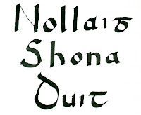
I found this writing style in an Irish primer published in the 1840s. I thought it was very pretty and decided to map it out in case someone wanted to use it for Christmas cards. Sorry, the second chart is a little hard to read, my printer is broken.  English can be written using Irish letters with a little bit of imagination, for example, Andrew has to be written as "Andriu," and Mary as "Mari" or "Muire." It's a very pretty writing style it is readable to us but is still a little ancient looking.
 
Nollaig Shona Duit (pronounced  "No- lihg HO- nah ditch") roughly translates as "Happy Christmas." If you want to say "Happy Christmas" to more than one person it would be Nollaig Shona Daoibh (pronounced "No-lihg HO-nah dih-ve.)


*Note: Excerpt from "A Primer of the Irish Language" from the College of St. Columba, published in 1845.

November 21, 2009

Spencerian Ladies' Hand- Mid-1800s Handwriting Part II


This is a continuation of an earlier post about Spencerian Handwriting which can be found here. This post includes the uppercase letters.

Knowing how to read and write in the Spencerian style is fun but also helpful. I have found that being able to read and write in the Spencerian style has allowed me to read  old letters and the inscriptions in books and on the backs of photographs easily. It takes a bit of practice but it is worth the effort. Reading Civil War soldier letters isn't such a struggle anymore. I loved to read the letters before, but now I love it so much more. It is immensely helpful if you have to read any large amount of period writing at a time. It is a beautifully romantic script I urge anyone that wants to learn to give it a try.
-->


This is the guide for lowercase letters in the Spencerian script.


Some tips on writing:
* Press as lightly as you can for the thin parts of the letters. Apply a small bit of pressure  for the darker parts.
*If your dark parts of the letters are not as dark as you need them at first, you can go over them again until you can do it naturally in one stoke.
* It helps if you mark out lines on the page in pencil to keep all of your letters straight.
*You can also print out guide sheets.


This is the stroke guide for writing the lowercase letters. Please forgive its blurriness, I could not get it any clearer.


Remember if you mess up there are two acceptable period corrections you can use:

1. You can “go with it.” Just leave it as it is, if it isn’t a big mistake, no one may notice it. If you don’t believe me, take a look at America’s most famous document: The Declaration of Independence.


Timothy Matlock for whatever reason messed up the ‘A’ in America. Millions have viewed the document and rarely do we see what is really there: “The Declaration of Independence of the United States of Жmerica.” No one really knows why he didn’t just use the normal round hand script ‘A’ every time he wrote America but he did for other words starting with ‘A.’ He also used a carrot to insert the word “only” as well. Don't fear mistakes, you may be the only one who notices. 

2. Cross it out with ink. This was done frequently in informal letters. In the 1800s a lot of things were still spelled as they sounded to the common people. Even the very educated made spelling mistakes. Accidental ink drops were fairly common too.
 Example
Another Example

*Note: The engraving is from The Payson, Dunton, & Scribner manual of penmanship (1873.)


October 30, 2009

Spencerian Ladies' Hand- Mid-1800s Handwriting

        Period handwriting is beautiful. A long time has passed since such a beautiful, aesthetic hand has been taught in schools. A common script in the mid-1800s was the Spencerian Ladies' Hand. It is a type of copperplate, similar to the kind that our parents (maybe??) learned in elementary school. There were numerous booklets and pamphlets written at the time to demonstrate how to write it. Many men and women also used Round Hand, which is very similar.
      For those of you interested in learning how to write in a period style, Lessons in Calligraphy and Penmanship is an amazing resource to learn virtually everything you need to know to learn. They have scans of original teaching books, as well as modern guides and videos that teach you all you need to know.

I have been trying to learn myself . I wrote out a guide in Spencerian Ladies' Hand (Left.) The darker parts of the letters are made by increased pressure, not by twisting the pen, like is common with other calligraphy "fonts". The nib you should use for this "font" should be very fine with a lot of bend to it. You can still buy Spencerian Pen Nibs. They can also be found by the boxes on Ebay. I just use what I have at hand.   

Civil War Reenacting Writing
I couldn't find many guides that showed the order in which to write each stroke. I wrote out the order that I used to make the strokes. I tried to make the strokes in the most natural way of writing. Hopefully, if you are interested in writing it, it will be comfortable. (We have to thank Andy for the pretty red ink I got to use for the arrows and numbers.)


While I was trying to learn this style of writing, my friend told me about a friend that she has who writes amazing calligraphy. Her friend gave her some tips for me that you can read on my friend's blog, Curious Acorn.

For the lowercase Spencerian letters, please see this continuation post here.

October 9, 2009

Dip Pens and Period Inks


         I love using dip pens. It is very calming to watch ink flow from the pen onto the paper.  Contrary to popular opinion, you don't  have to dip your pen in ink after every word, or even in after every sentence. Dipping the pen is hardly an inconvenience at all. It is so enjoyable I wonder why it went out of fashion--that is until I shake a large splotch of ink onto my paper and then smear my hand it in.
         Believe it or not, my other half used to use a dip pen throughout his high school career and  reports only having one very  bad spill in the classroom.  I was not so brave and used a cartridge calligraphy pen in class and a dip pen at home for drawing. I've had very few serious accidents with ink myself.
       Nothing beats the look and feel of pen delivered ink on paper.  It leaves a very crisp line that is slightly raised to the touch.  The inks vary in color but you can always produce some really beautiful effects and drawings with whatever ink you have. Just remember to clean your pens after each use ( I should take my own advice.)


An Ink Receipt From The New Family Receipt Book (1811):

 To Make Excellent Ink.
            “Take a pound of the best Aleppo galls, half a pound of copperas, a quarter of a pound of gum-arabic, and a quarter of a pound of white sugar-candy. Bruise the galls, and beat the other ingredients fine; and infuse them all in three quarts of white wine, or rain-water. Let this mixture stand hot by the fire three or four days; and then put it on a slow fire so as to boil. Stir it frequently, and let it stand five or six hours, till one quarter of it be evaporated. When cold, strain it through a clean coarse piece of linen; bottle and keep it for use.
            The communicator of this good old receipt is convinced that much pains have been taken to ascertain the due proportions of the galls and copperas: for he has found that, on diminishing or increasing their relative quantities as above, the ink has always been pale; but this defect will sometimes happen if the materials be not of the best kind The quality of the paper written on will also make a difference in the colour of the ink.
            The grand secret in preparing this ink, which will never change its colour, if properly attended to, though kept never so long, consists in the keeping free from that mouldiness, which in hot weather particularly, is apt to form upon the surface. The best way, is to put it into a large, glass bottle with ground stopper and to shake it frequently.”

As some of these chemicals are hard to come by today, I've found some receipts that utilize the same chemistry as the original ink. These are quality inks and seasonally appropriate as they require walnuts as their source of tannic acid instead of  Aleppo gulls. If you like the slightly brown ink of antique documents, you will like the walnut ink.


Copyright © 2008-2020 Stephanie Ann Farra. All rights reserved.

All materials posted on this site are subject to copyrights owned by Stephanie Ann Farra. Any reproduction, retransmissions, or republication of all or part of any document found on this site is expressly prohibited, unless the author has explicitly granted its prior written consent to so reproduce, retransmit, or republish the material. All other rights reserved.